Patch Designing Do’s & Don’ts
When setting up your designs for embroidery it’s important to keep these general requirements under consideration to make the design and end result seamless.
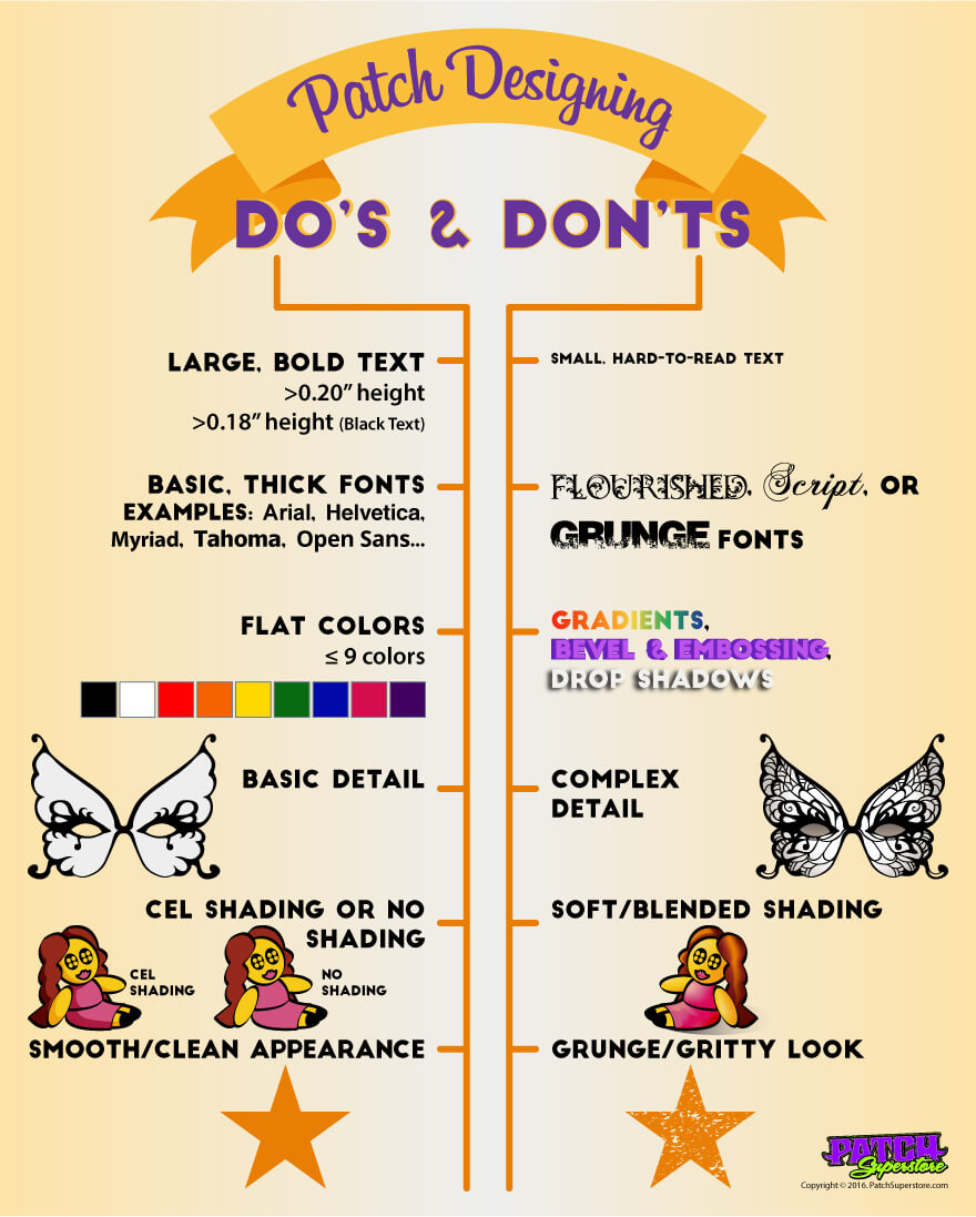
Here are the things Not to do when designing for embroidery:
No
- Small, hard-to-read text
- Flourished, script or grunge fonts
- Gradients, bevel & embossing, drop shadows
- Complex detail
- Soft/blended shading
- Grunge/gritty look
Now that you know what not to include in your patch design here are the recommended list of things you should do.
YES – Include:
- Large, bold text
- 20” height
- 18” height (black text)
- Basic, thick fonts
- Arial
- Helvetica
- Myriad
- Tahoma
- Open Sans
- Etc
- Flat colors
- 9 or less
- Basic detail
- Cel shading or no shading
- Smooth/clean appearance
Now you should be able to follow these guidelines so your patch artwork will match your embroidered patches.
Download this infographic.


